Captain Chris. Canal homes, by boat.
A Cape Coral realtor who knows the canals from the helm and shows homes from the water. He came to us with hours of boat-ride footage and a speedboat emoji for a logo. We drew him a mark of his own and built a small kit around it, sized for the places he actually posts: Shorts, Reels and carousels.
From an emoji to his own boat.
He'd been using the speedboat emoji as his logo. The colors were right: orange hull, pale deck, blue water. But the drawing belongs to a free emoji set that millions of accounts share, so it could never be his. We kept the colors and drew the boat he actually runs: a deck boat with a bimini top, a rail, an outboard on the back, heading toward his name.
At favicon size the rail and canopy struts disappear, so the favicon is a separate drawing: hull, windshield, motor and water, nothing else.
Transom lettering.
The name is set the way a boat's name is painted on its stern: a sign-painter script for "Captain", a heavy slab for "CHRIS". Every file ships with its type outlined, so it looks the same in a video editor, a phone app or an email signature, with no fonts installed.




Straight off the boat.
Five colors lifted from the logo he already had, so the people who know him still recognise him. We added one dark, Gulf Night, because the emoji had none and his video needs somewhere for type to sit. Click any swatch to copy it.
Two faces. That's it.
A script for one short phrase, and a slab for everything else. Bitter runs from the heavy "CHRIS" down to the captions and labels, so every word on screen belongs to the same family as the name.
Sign-painter lettering, like a name on a transom. For "Captain" in the logo and one short phrase per frame ("from the water"). Never in all caps, never more than three words.
An editorial slab with a real weight range. 900 for the name and title cards, 800 for headlines, 600 for captions and the tracked uppercase labels, 500 for supporting lines.
Built for the phone.
His first Short runs on his own narration from the boat, with captions set in Bitter and kept clear of the YouTube and Instagram buttons. Each video gets a matching carousel of stills from the same ride.
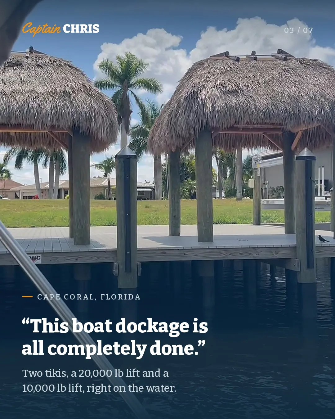
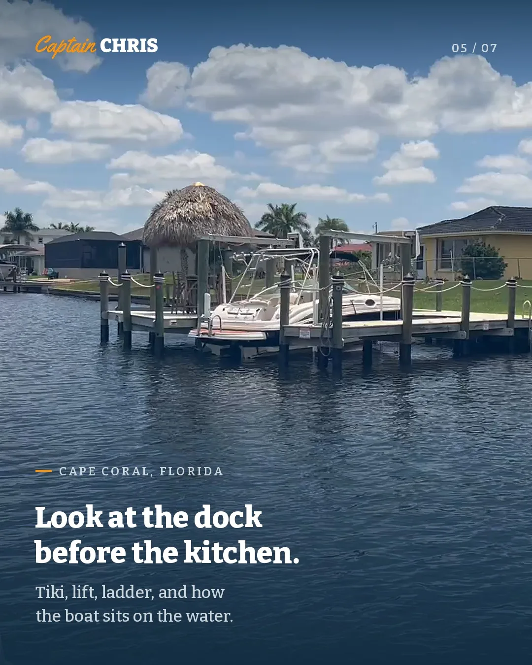
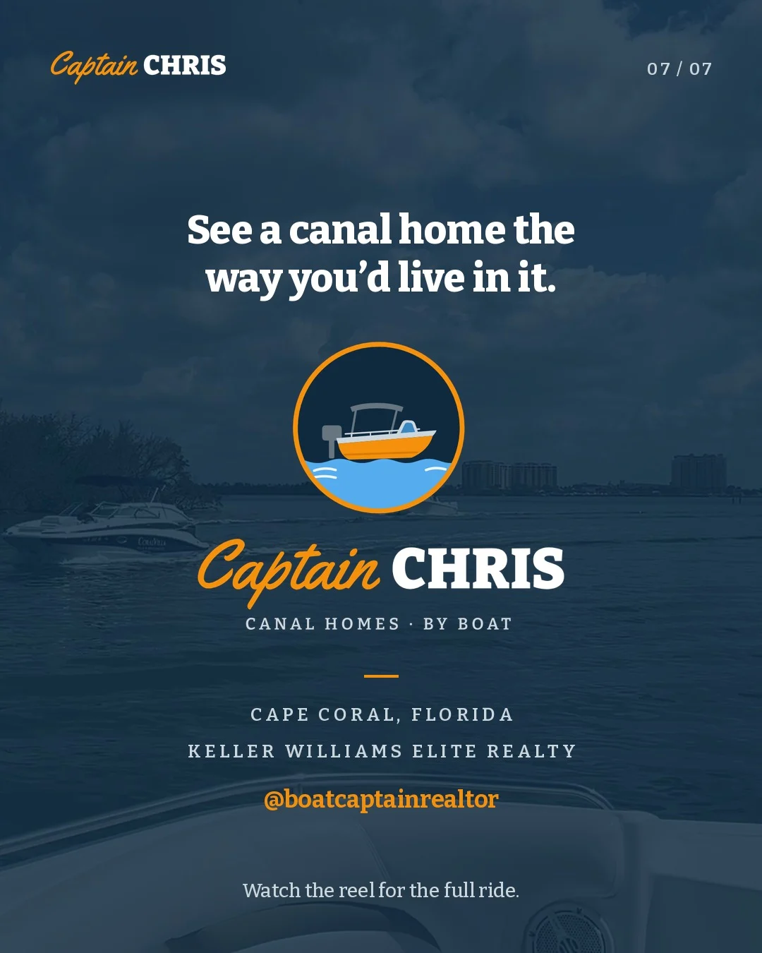
The right size in the right place.
Every post ships as four shapes, each cut for one slot. A carousel image posted as a Story gets letterboxed; a Story frame posted to the feed gets cropped. So each file goes only where it was made to go.
The reel. Instagram and Facebook Reels, TikTok, and YouTube Shorts (its own end card with his YouTube handle).
A swipeable post that stays on his grid. Instagram and Facebook feeds. Header, place line and text block sit on the grid.
Full-screen, gone in a day. Type stays below the 250px top bar and above the 340px reply bar; the last frame leaves room for a link sticker.
The carousel as a LinkedIn document post, so it swipes in the feed.
Talk like the helm, not the listing.
His footage is already the voice: unhurried, specific and on the water. The rules keep the copy around it the same way.
Do
- Let him talk. Quote his narration; don't paraphrase it into ad copy.
- Name the water: the river, the basins, the canal systems he's riding.
- Be concrete: lift sizes, tikis, how a boat sits at the dock.
- Put the brokerage on every end card.
Don't
- Don't call a home for sale unless it's his listing, and never show someone else's sign.
- Don't promise Gulf access, bridge clearance or a price for a specific home.
- Don't use "#1", "best" or "luxury". The boat does the bragging.
- Don't use the script for more than three words.
Every file, zipped.
SVGs with outlined type, PNGs sized for avatars and end cards, the palette, and links to the two free typefaces.