Same hands. Different light.
The full Refract Ventures brand kit — the actual mark, the actual palette, the actual type. Pulled straight from the live site for your designer to use anywhere.
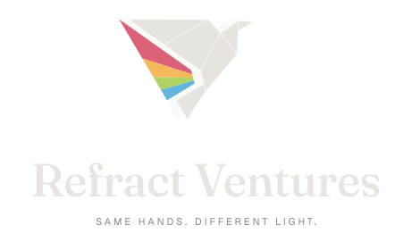
The Refract glyph.
Four colored polygons — Cardinal, Saffron, Sky, Meadow — refracted through a white frame. The mark is the brand idea. Use it whole, never recolor the polygons.





Warm neutrals, refracted light.
A grounded set of warm darks and bones, plus the four refracted-light accents pulled from the mark. Click any swatch to copy.
Neutrals
Refracted light
A serif and a sans. That's it.
Cormorant Garamond sets the mood — old-world warmth, modern weight. Inter handles the rest. Both free, both on Google Fonts.
Used for headlines, hero statements, property names. Favor weight 500. Italic for emphasis and pull quotes. Available on Google Fonts.
Used for body copy, UI, navigation, captions, and uppercase labels. Weights 400, 500, 600. Available on Google Fonts.
A custom icon set.
All icons drawn at 24×24, 1.5px stroke, rounded caps. Inherit color via currentColor — set color on the parent and the icon follows. Click to copy SVG, or download individually.
Missing an icon? Request one.
How we sound.
Family-run. Direct lines. We live here, we answer messages ourselves. The voice should sound like a person, not a brand.
Do
- Speak like one of us is in the room. Plain, calm, specific.
- Use place names — Lake Atalanta, Putnam District, Hobbs State Park.
- Lead with what's true and concrete: "1 parcel · 4 units" beats "premium portfolio."
- Let italics add quiet weight — never decoration.
- Use the tagline sparingly. It's a closing line, not a header.
Don't
- Don't say "luxury," "boutique," "best-in-class," or "experiences."
- Don't sound like a property management company. We're not.
- Don't use exclamation points. Ever.
- Don't write a sentence longer than 22 words.
- Don't use emojis in marketing copy.
The whole kit, zipped.
Logos, icons, and a colors.txt reference — ready for Figma, Illustrator, or wherever your designer lives.